
CONTEXT
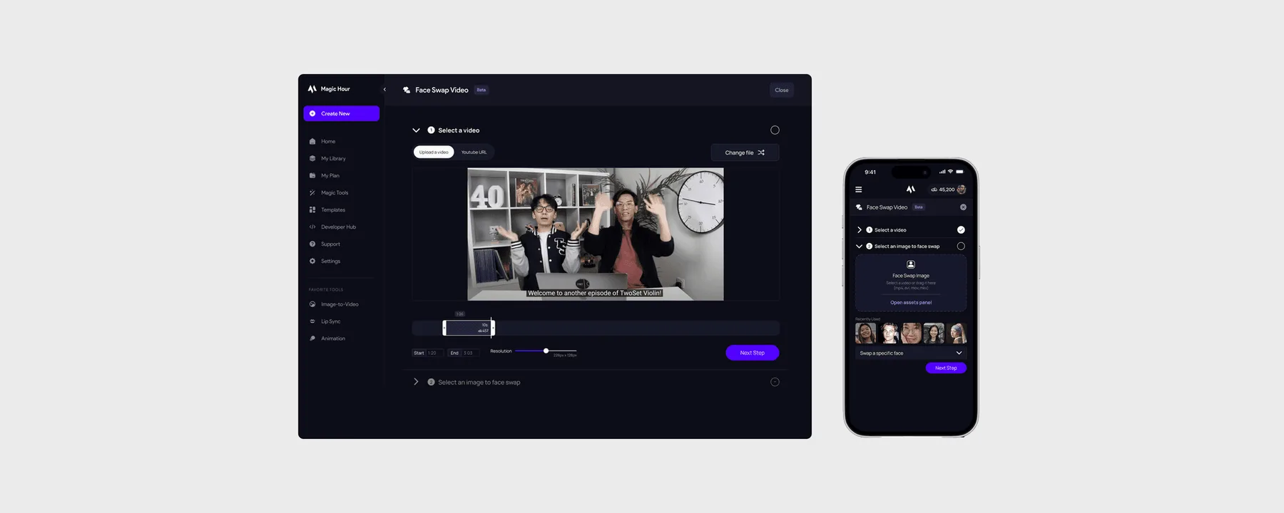
Magic Hour is an AI video creation platform
I first saw Magic Hour on Twitter and thought their product was funny. Their flagship product is their face swap feature, and I first used it to create my own video to show to my friend. We both had a good laugh!
PROBLEM
35% of users fail to fully render a face swap video, and 15% experience dead clicks
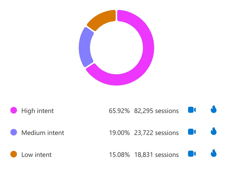
The existing design is convoluted
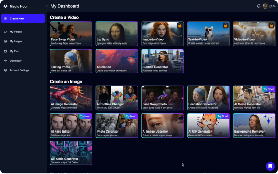
Initial Design
❗ Waits until the end of the product flow to tell users that they are over the frame rate
❗ Does not clearly tell users the number of frames they have
❗ Uncertainty of length of process
Redesign
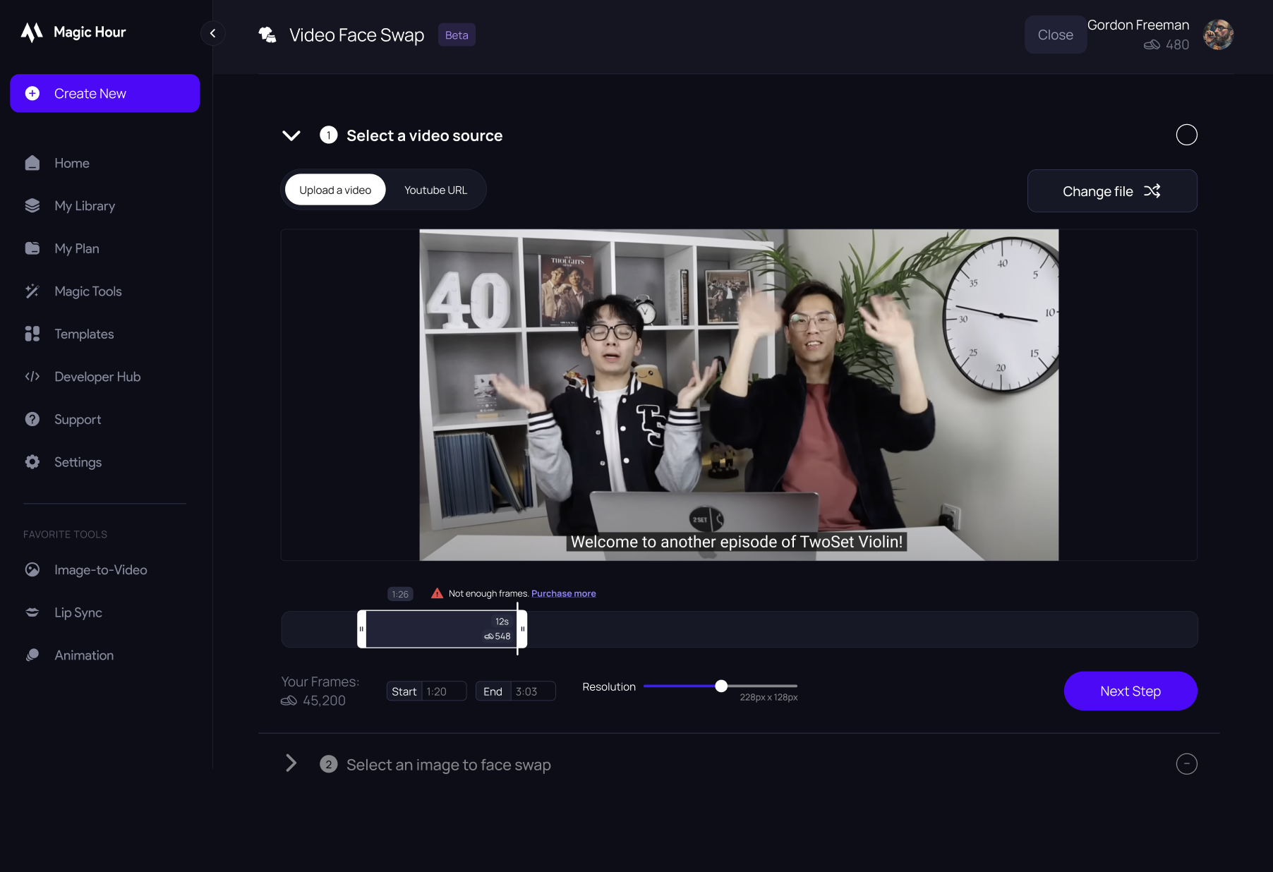
✅ Clearly tells users how many frames they have & need
✅ Sleek UI
✅ Allows for in-depth face swap capabilities for users who need it
RESEARCH & PLANNING
Synthesizing preliminary user tests
I first conducted a cognitive walkthrough of the initial product flow. My unfamiliarity with Magic Hour's platform as a new user helped me identify potential issues that led to early drop-offs, and UX confusions.
When I joined Magic Hour, they had 12 user test screen recordings. I watched all the screen recordings, and noticed that the majority of user dissatisfaction came from one of the following pain points:
01
Confusing UX
Features such as "multi-face swap" and uploading a Youtube video are not immediately obvious to the user.
02
Lack of Cost Transparency
Users are only told about potential price warnings after they have completed the entire flow.
03
Lack of readily available assets
Many users did not have a clear headshot on their device that could be used to swap faces.
Prototyping and testing over a/b tests
This was my first project as a remote designer. I was concerned about the amount of additional work it would take to implement a/b tests. I decided to create Figma prototypes and conduct user tests.
PROTOTYPING
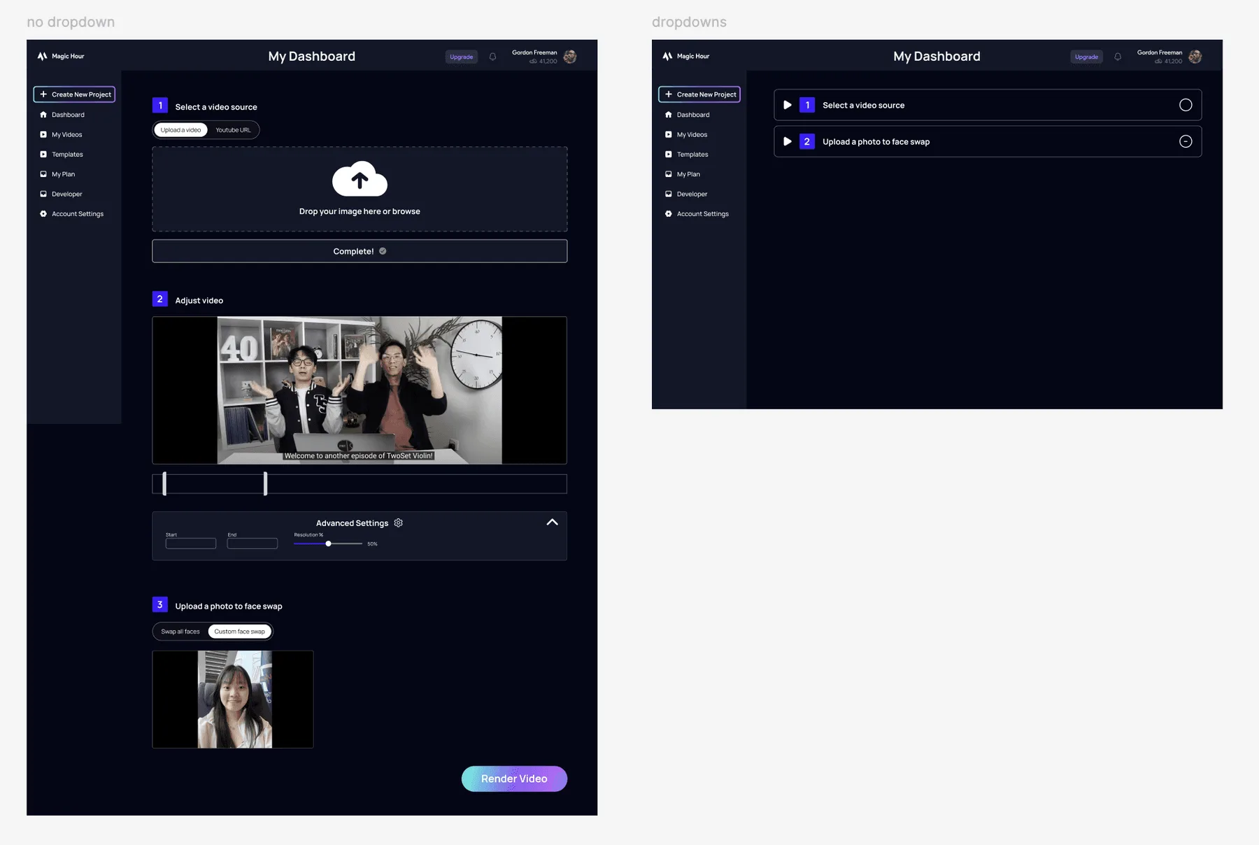
A single page layout allows users to anticipate next steps and the length of the process
My first intuition was to reduce the product flow to a single page. Having all the information clearly laid out gives a good idea of how many steps are next, and reduces unnecessary clicking. I made two low fidelity prototypes, one with each step as a toggle and the other without.
A potential concern with the collapsed dropdowns is that it could lead to slightly higher drop-off, as the user has to click a tab before they proceed, as opposed to the initial design where they would see the upload box immediately.
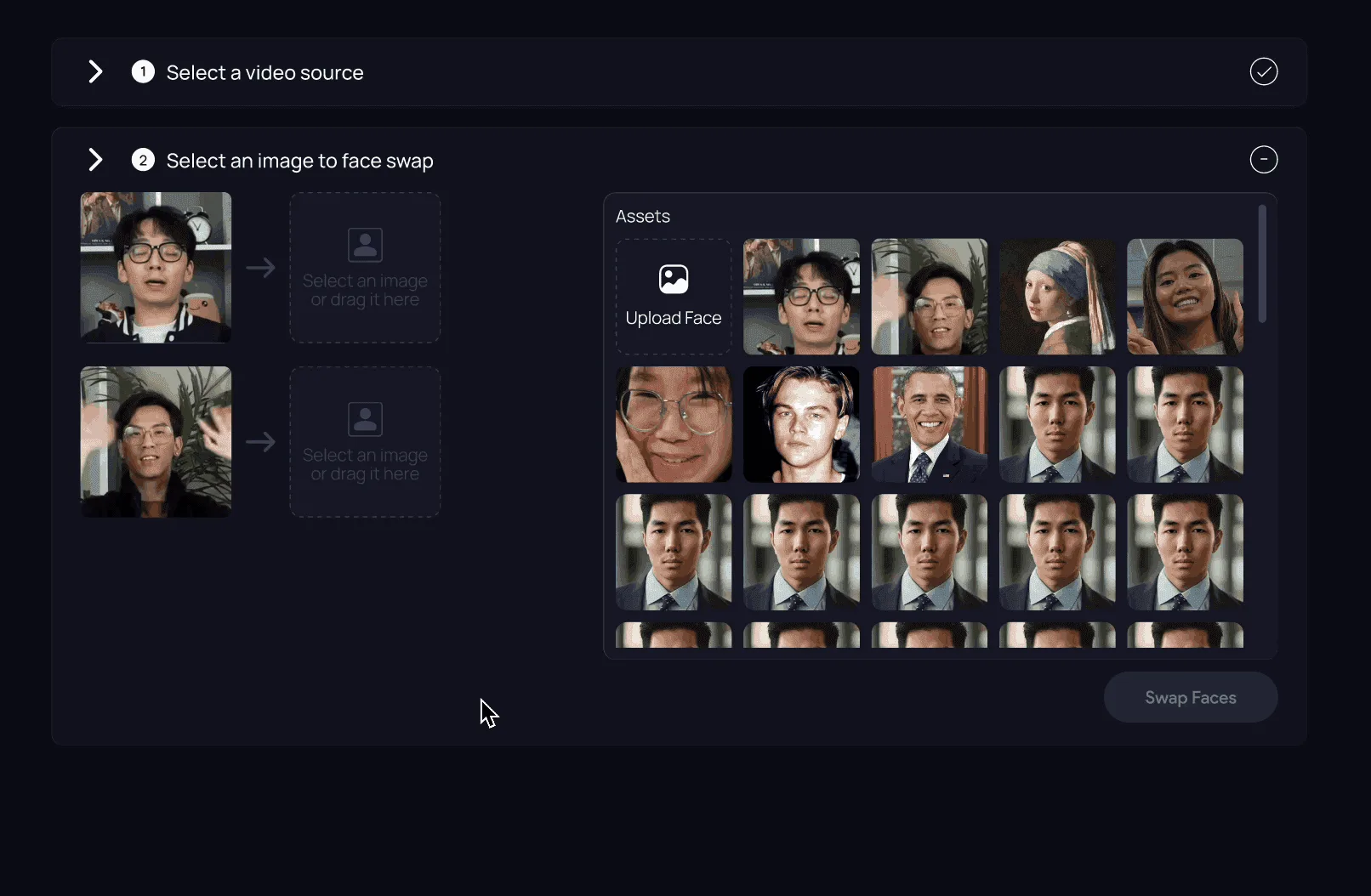
An assets panel so users don’t have to dig through their files for a portrait photo
I created an assets panel with curated face portraits and recently uploaded photos to reduce friction in the face swap flow. A/B testing showed an 80% reduction in user drop-off. The assets doubled as examples that helped users understand which photos work best.
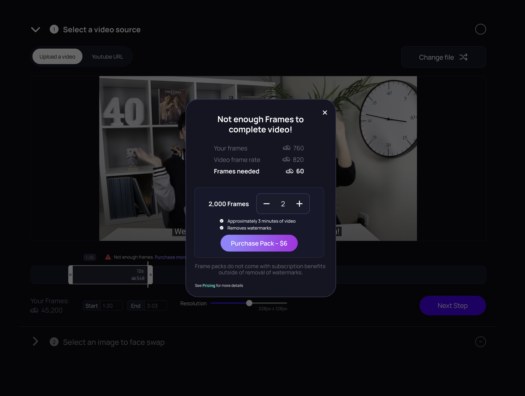
Cost transparency reduces dropoff and decreases deadclicks
The moment we are able to discern that users may not be able to render their video, it is important to notify the user to reduce frustration. This is also a high-impact conversion point for users to purchase more frames.

Reserving GPU-intensive capabilities for high-intent users
When face swapping, users have two options:
- Swap all faces: Upload one photo and replace all faces in the video with that one photo
- Multi face swap: Select specific faces to swap with other faces
Only 2% of users who created a video used the "Multi-face Swap" function. We felt this percentage was disproportionately low. I suspected it was because the term "Multi-face Swap" doesn't make its own function apparently clear.
GPU considerations for multi-face swap
Swapping multiple faces in a video is useful, but very GPU intensive. Thus, specific face-swap features should be reserved only for high intent users.
Initial Design
✅ Not intensive on GPU
✅ Minimal clicks
❗ Multi Face Swap is used 2% of the time
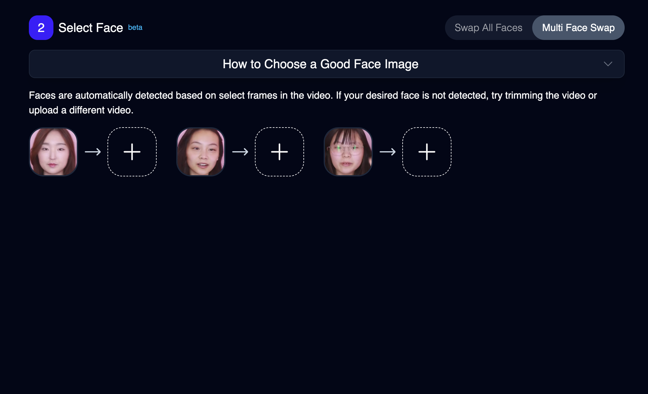
Low visibility segmented button
Redesign w/ GPU considerations
✅ Easily allows for more customization if needed
✅ Not intensive on GPU
✅ Minimal friction
❗ Opening specific face swap toggle may be overwhelming to user
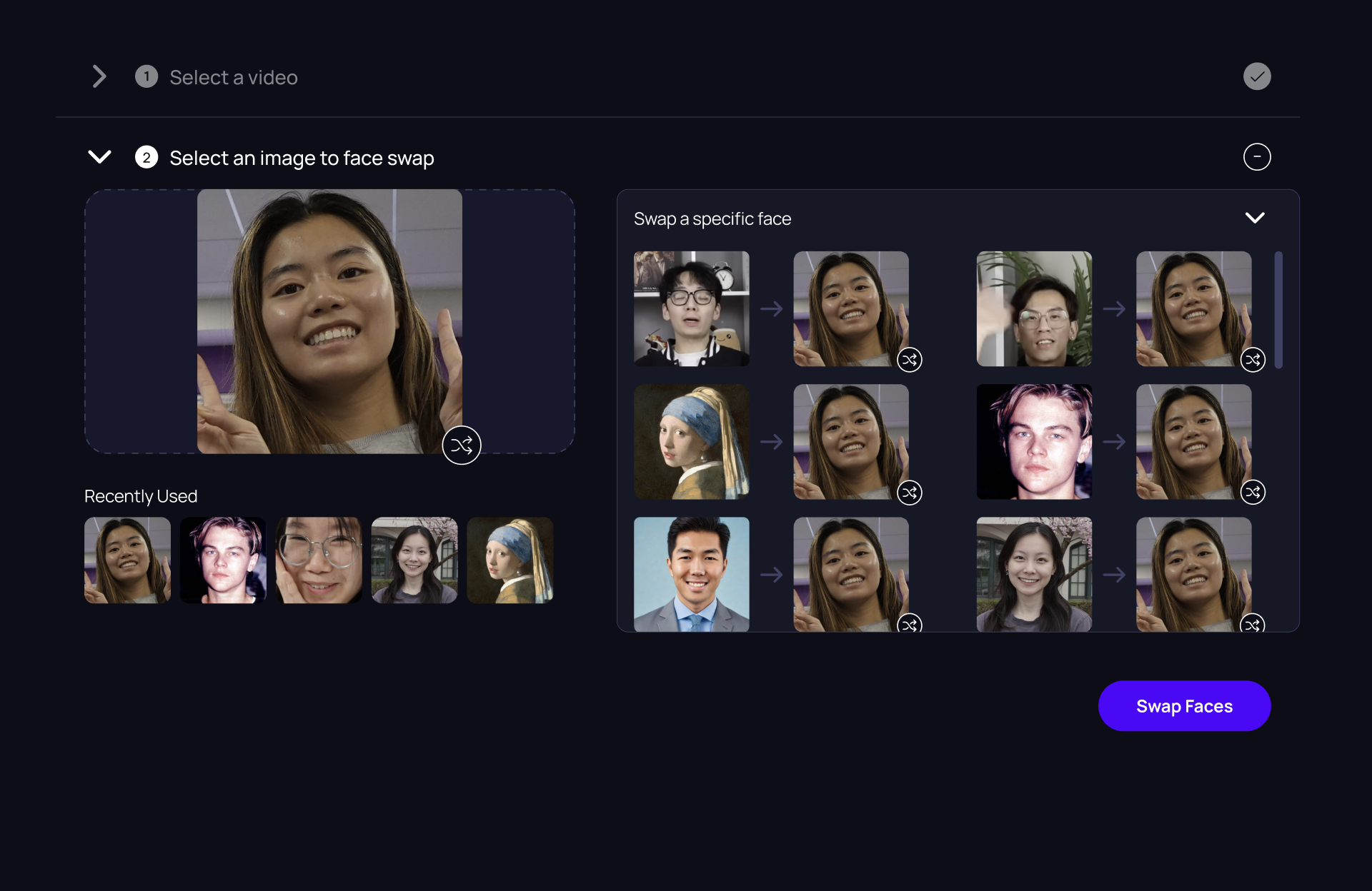
First image upload swaps all faces in the video
A specific face can be customized within the toggle
VISUALS
Prioritizing minimalism & clarity
Several UI changes were made to adhere to Magic Hour’s new branding, as well as create a more premium look and feel.
Initial Design
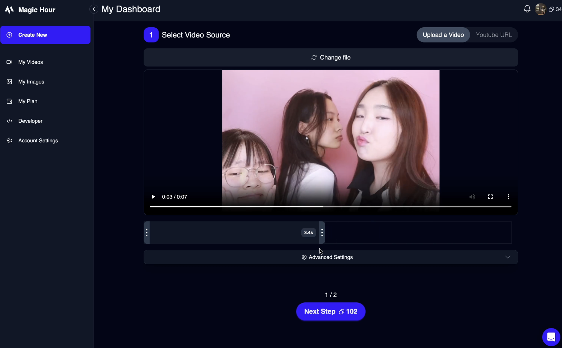
Redesign
REFLECTION
The impact of content design
The confusion caused by the term "multi-face swap" was a challenging problem to handle. It was the first time I concretely and immediately felt the impacts of sub-optimized terminology and content design. I had a lot of fun diving into content design principles, and referred to Andy Welfle and Michael J. Metts' book "Writing is Designing" as a frame of reference.
Optimizing user tests
Finding a balance between making changes and conducting user tests was very important. It was easy to want to validate every small design decision I made, but conducting user tests takes a lot of time and resources ultimately slowing down the entire design process. At a startup like Magic Hour, designs must be executed quickly so I found myself making a mental note of when I should best conduct user tests, and make small tweaks between each tester.
