
CONTEXT & PROJECT OVERVIEW
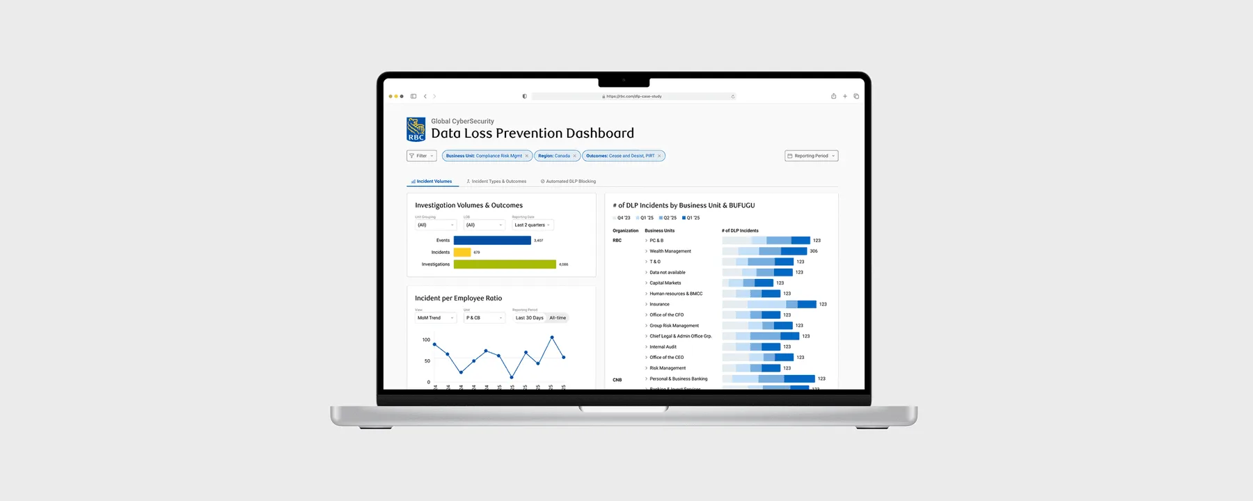
Reimagining the Data Loss Prevention (DLP) Dashboard
I joined RBC as a Design Engineer Intern on the Data Loss Prevention (DLP) team where I was tasked with redesigning and building the DLP dashboard.
The current dashboard was created using Tableau, and the DLP team was looking to develop it from scratch internally. Along with two developers and a PM, I served as the sole designer on the team.

SOLUTION & IMPACT
Before & After
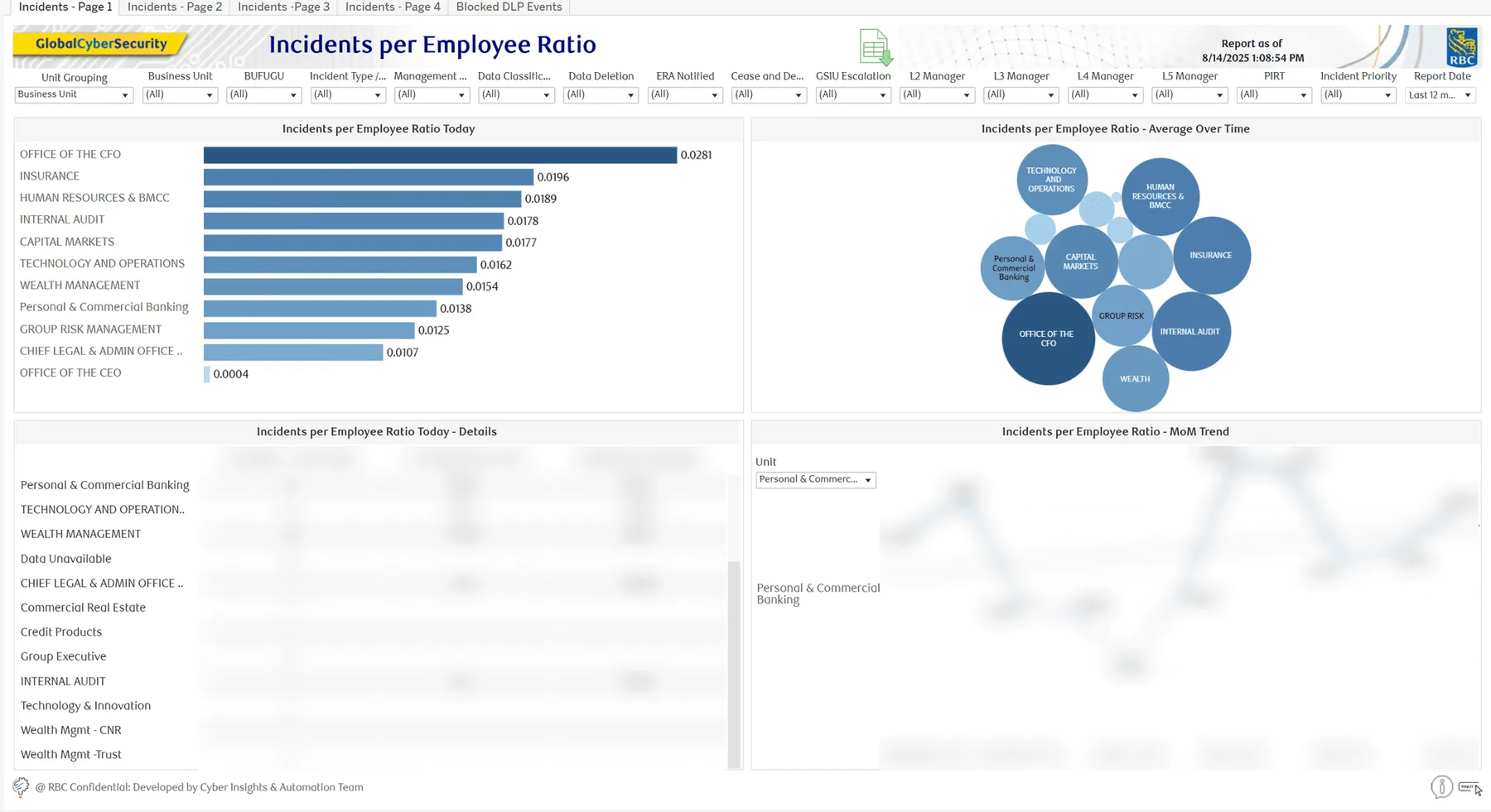
Previous Experience
01
Overwhelming information
Difficult for users to process all at once
02
Inefficient navigation
Convoluted user flows, confusing filtering system
Redesigned Experience
01
Clear hierarchy
Streamlined data visualization and UI redesign
02
Improved usability
Revised filtering and sorting system
Impact & Scope
RESEARCH
Truly Understanding DLP Protocols
To build a solid understanding of DLP protocols, I began by initiating in-depth conversations with my manager and several members of the DLP team. I then reached out to the dashboard users to obtain a better understanding of the nuances.
ANALYSIS
How might we help a wide variety of users ranging from technical auditors to VP managers understand the breadth and depth of data loss at RBC?
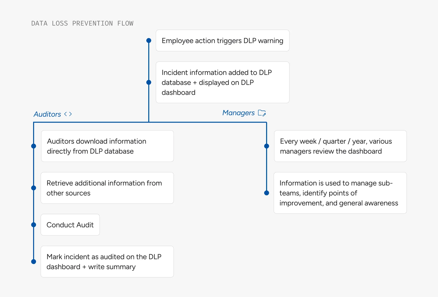
After assessing survey responses, I noticed two main user groups emerging. Internal auditors were more interested in the granular numbers and details of DLP incidents, whereas managers were interested in the higher level trends.
01
Internal Auditors
- Determine which incidents to audit
- Obtain information about their assigned incidents
02
Managers (of varying jurisdictions)
- Understand the breadth and depth of data loss within their jurisdiction
- Prevent future incidents from occurring
KEY DESIGN EXPLORATIONS
Categorizing data into intuitive sections
The existing dashboard had 5 pages. 4/5 pages were reported by users to have seemingly arbitrary graphs that were not sorted or clearly defined.
Initial Tabs

Redesigned Tabs

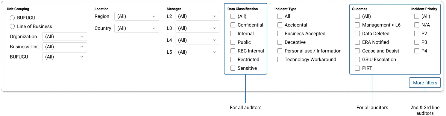
Advanced filters for auditors
I spoke with first, second, and third line auditors to identify the additional filters that should be added, sorting requirements between "must-have", "nice-to-have", and "bonus".
A key pain point for auditors is that the dashboard did not have built-in filters for auditors to sift through the cases they need to assess. As a result, most auditors were manually exporting data from the dashboard as a CSV file.
UI redesign to fit within RBC’s design system
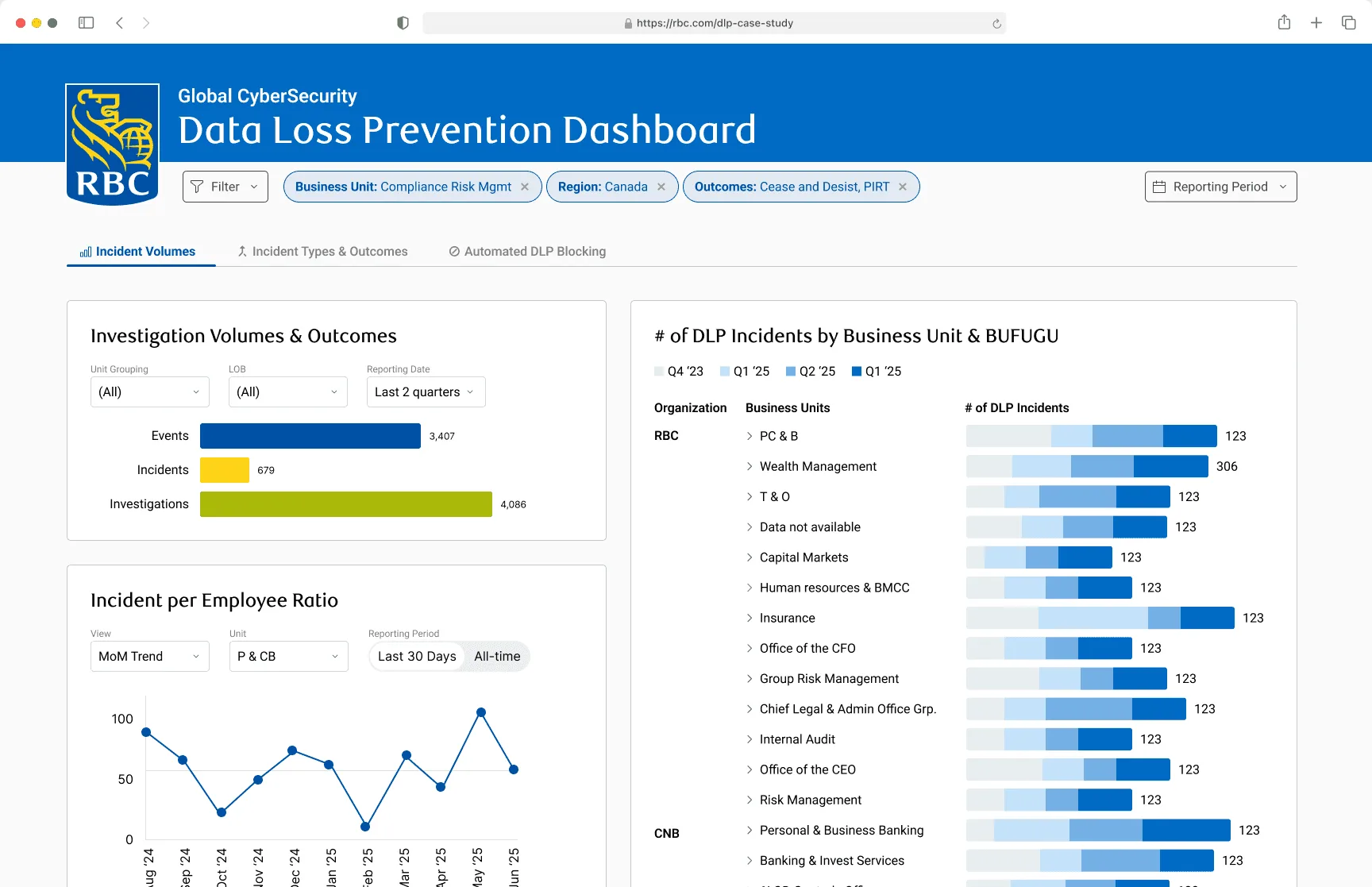
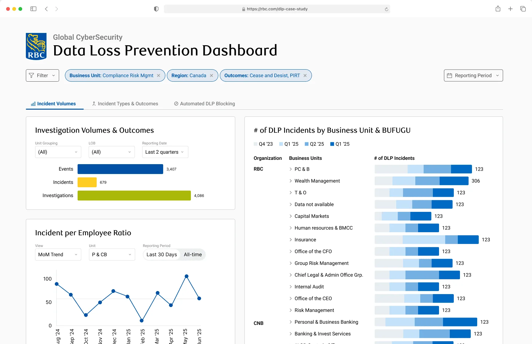
RBC has a comprehensive design system called RIG. I created two high-fidelity dashboard iterations, and ultimately went with the second one to prioritize simplicity.
Dashboard iteration #1
Dashboard iteration #2
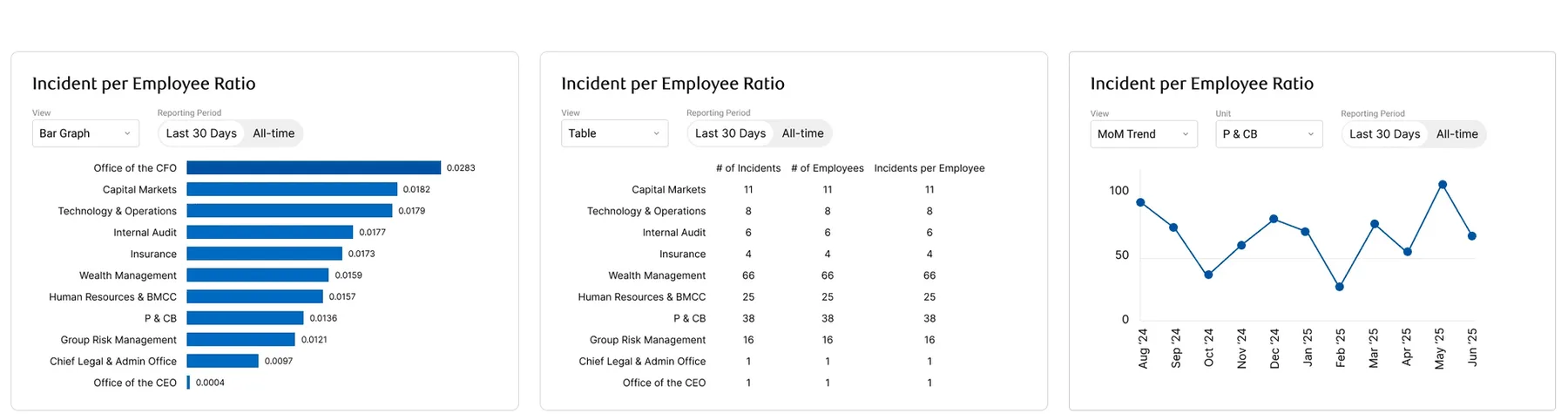
Standardizing data visualization
Many managers, especially ones that oversee data loss at a higher level, first focus on trends before examining numbers. I standardized all graph styles and displayed them based on most interacted with after looking at a heatmap of the existing dashboard.
REFLECTION & NEXT STEPS
This project was handed off to a team of developers
I made sure my design files were developer ready, front-end code was readable and properly structured, as well as created several screen recordings to explain my process and the functionality of the dashboard.
Make the most of interviews & surveys.
I learned that asking open-ended questions and creating space for participants to share stories often revealed deeper motivations than surface-level responses. Pairing quantitative survey data with qualitative interview feedback allowed me to validate patterns while also uncovering nuances that shaped design decisions.
Designing for a wide range of users with specific goals.
The dashboard had many different users with different (and often contradicting) goals, so it was a challenge to find ways to display information for the users who need it while maintaining a good high level overview of the metrics.
